I’ve always had this dream of being the fullest, full stack developer. I would take an idea, design something awesome, and then go build it. Unfortunately, anytime I tried UI design I was a fish out of water. I’d stare at a blank screen not knowing where to begin. And in the unlikely chance I put something on the page, I was overwhelmed with choices like colour, font, and layout that I would be paralysed. Recently, I sat down and really tried to overcome these roadblocks. After many hours watching other designers, learning about colour theory, and understanding design foundations. I realised that there are some simple guidelines to develop a design that looks good enough. By no means am I an expert, it takes years to develop an eye for design. But if you’re a developer like me, and you just want to create something you’re proud of then these tips will help you.
Choosing your design tool
Before diving in, I wanted to quickly touch on design tools. There are three main ones; Sketch, Figma, and Adobe XD. They all function roughly the same. Sketch is Mac only, while Figma and Adobe XD are cross platform. Also, Sketch is paid while both Figma and Adobe XD have free plans. I ended up going with Figma over Adobe XD because it has unlimited cloud storage and better syncing between the desktop and web app. Hopefully, this quick summary helps you make your choice!
Start with greyscale
I agonise over colour choices. It starts with looking at the trending palettes in Adobe Color or Coolors. Cut to many hours later, and I’m scrolling through Dribbble wondering if my green is too green. By the time I realise I haven’t achieved anything meaningful, I’m so tired from decision fatigue that I call it a day.
If this sounds like you, then I have one tip. Don’t use colours! At least not until you have all the layout, content, and elements in your design. Instead, you can use a combination of greys to mark where you want want to use lighter or darker colours in the future. By postponing the choice of picking a colour scheme you avoid decision fatigue. And you actually get to building your design faster.
More Resources
- 4 Reasons why you should design without color first - Anand Satyan
Layout with big, medium, small
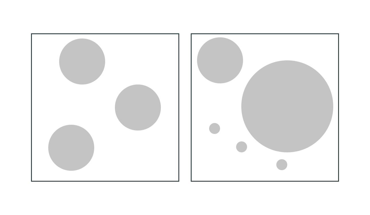
Every layout should have a big, medium, and small element (or elements). Having contrasting sizes helps draw your eye to certain parts of the design. And it makes your design more dynamic. Here’s an example with circles.

On the left, your eyes naturally goes top down. But on the right they start in the middle, go to the top, then to the bottom. You can use different sized elements to really highlight what you think is important. It also helps provide balance to your page. Following this rule, has changed my mindset from treating each shape individually to understanding how they interact with each other.
More Resources
- Intro to Layout - Flux
Follow the 60-30-10 rule
At some point, you’ll need to add colour to your design. Normally the first step is to find a colour palette. I don’t know about you, but for whatever reason, I find using a palette really hard. I even read a bunch of stuff on [colour theory], an entire body of work that explores the meaning of colour. While it was an interesting read, I didn’t find any practical information. Then I discovered the 60-30-10 rule and applying colours started making sense. The rule states that your primary, secondary, and accent colour takes 60, 30, 10 percent of the page (respectively). An extension to this guide is knowing that you need more than the five colours in a palette. Using greys and different shades of your accent or secondary colour gives you much more flexibility when designing a page.
More Resources
- How to use Color Palettes - The Futur Academy
- A Simple Web Developer’s color guide - Smashing Magazine
- Choosing colors for web design: A practical UI color application guide - Dribbble
- Building your color palette - Refactoring UI
Columns are your friends
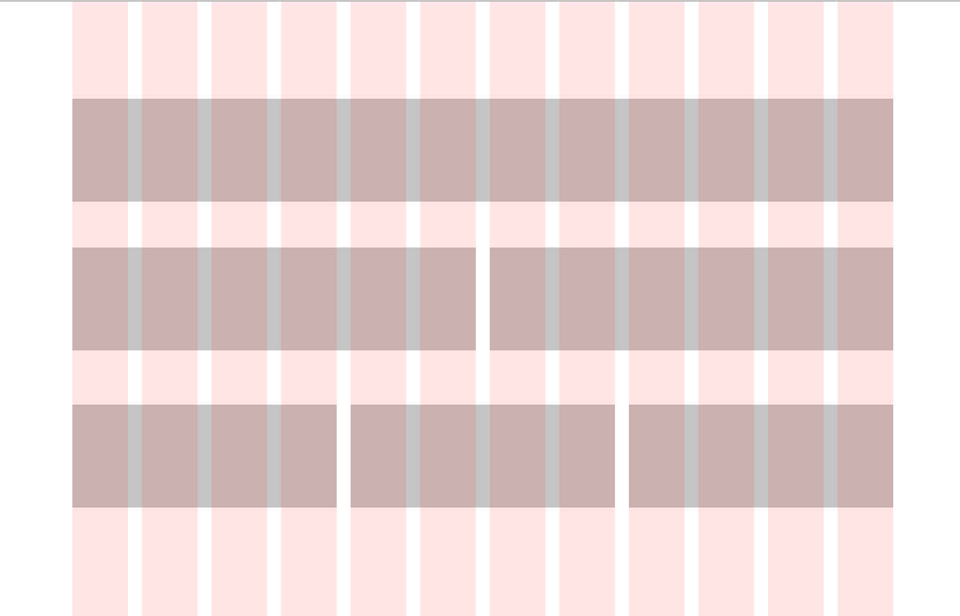
Columns are part of a visual layout called a grid, by leaning on columns placing elements becomes much simpler. Using columns in Figma looks like this:

A good rule of thumb is to use 12 columns on desktop, 8 on tablet, and 4 on mobile. Having an even number of columns gives you more flexibility when placing smaller elements. The space between the columns is called the gutter. It’s important to not leave an element in the gutter. By keeping items inside the columns you have an easier time with alignment.
More resources
- Responsive Grids and how to actually use them - Christie Tang
- Building Better UI Designs with Layout Grids - Smashing Magazine
Be intentional, be consistent
My final tip is to be intentional and consistent with your design. Consistency is something that Steve Schoger (author of Refactoring UI) talks about in his design videos. Spacing, colour, and placement should be consistent across multiple pages. It’s really easy to elevate your design by tightening up these things.
Being intentional is really about providing the user context. If you don’t know why you’re doing something in your design, then the user isn’t going to know either. Personally, I think the reason has to be more than “it looks cool”. I realised how important this was when I showed someone my design below. I was super proud of the blobs and thought they looked really cool. But the feedback I got was “why are there random blobs on the page?”.

I had no answer to that question. It made me rethink what I wanted to show vs what the user was actually seeing. With these two ideas in mind you have a guide anytime you need to make a decision.
More resources
- Any video by Steve Schoger. He walks through his design process and it’s super informative.
- 7 Practical tips for cheating at design - Adam Watham & Steve Schoger
Whats next?
With these tips hopefully starting your next design will be a little less daunting! I’ve only just begun my design journey and I’ve really enjoyed flexing the creative side of my brain. Like with programming, the more designing you do the easier it gets. What I really want to improve on next is getting better at using Figma. By knowing the shortcuts or how to use certain features, I can speed up my design work. And hopefully spend more time designing and less time googling!
I’d love to know if this post brought you value, if you have other tips, or if you want to share your journey! Reach out to me on Twitter, or shoot me an email.