What will you learn:
- What technology can be used to build a blog
- The process I have when building a site
TL;DR - This site is built with SvelteKit and hosted on Netlify. It’s open sourced, take a gander!
Some time ago, I embarked on a journey to redesign my website. I convinced myself that I needed a fresh, clean, minimalistic, snazzy, whimsical, <insert adjective> site to be able to write content.
While this reasoning is flawed. Rebuilding my site allowed me to play with SvelteKit. A framework for Svelte that was fresh out of beta when I first started the rebuild. It was also an opportunity to practice my design skills. Opting this time around to design most of my screens in Figma before building.
Throughout this entire process I made heaps of mistakes and discovered what worked and what didn’t. All the lessons that I’m excited to share!
Designing upfront
Tools: Figma
Resources:
- Refactoring UI
- Figma Youtube Channel
- Level Up Tuts: Design Systems in Figma (Paid)
- Design + Code: UI Design for Developers (Paid)
I’m no design guru so I can’t speak too much to colour theory, typography and other design-y stuff. But here’s what worked for me.
Start with the layout
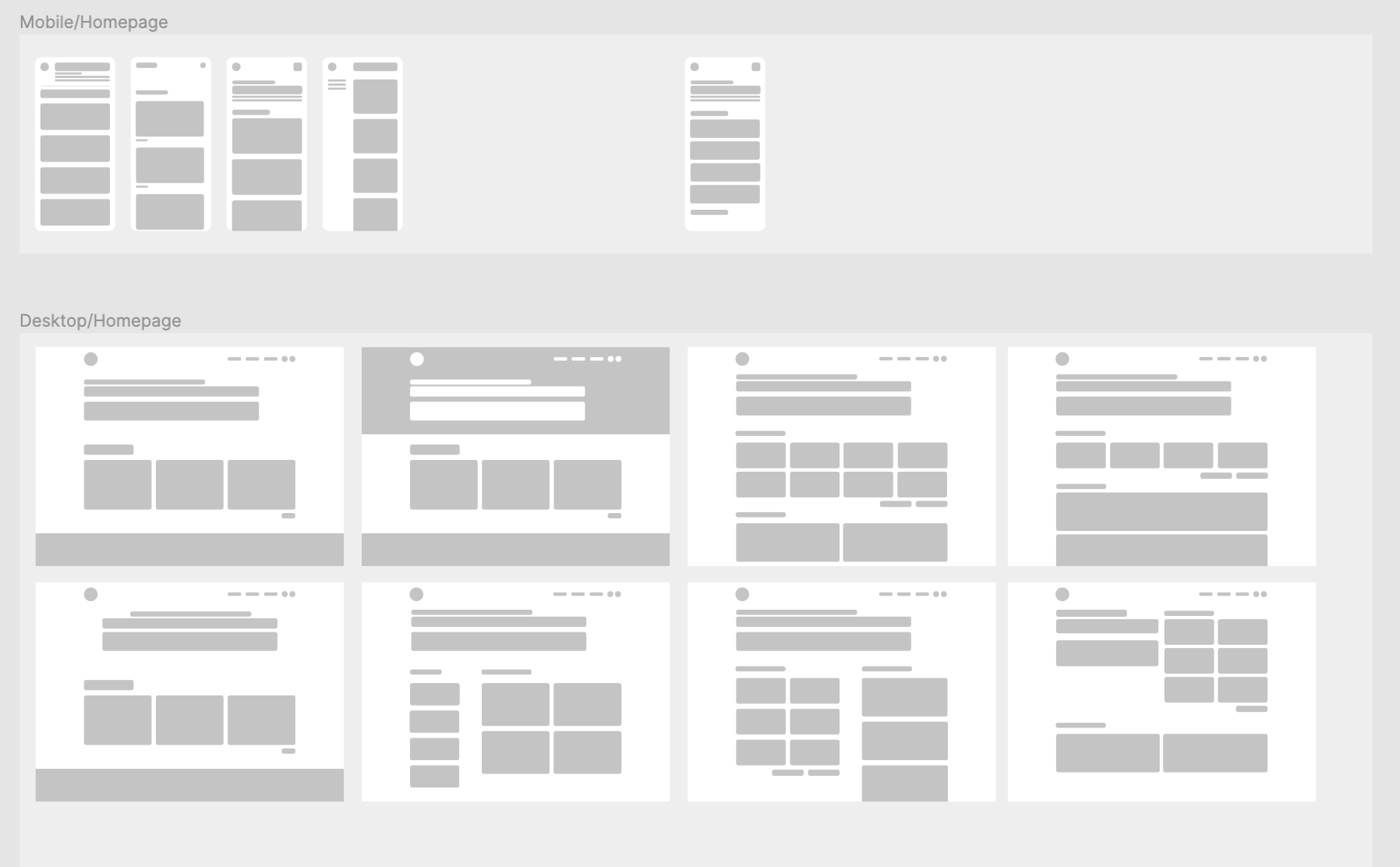
I focused initially on building the layout of my site (both mobile and desktop) using grayscale and blocks. I went around to all the sites that I found aesthetically pleasing and took inspiration of their layouts. Then I used these blocks to play around with how my content would be structured.
This was focused only on the homepage since I thought that would be the most visually complex page. But I would have found value doing it for the posts page as well.
What I was looking for was:
- Visual hierarchy - do the blocks flow and fit together.
- Spacing - Is there room for the blocks to breathe or does it feel cramped?
- Focus - Is there too much information presented at once?

Setting up a design system
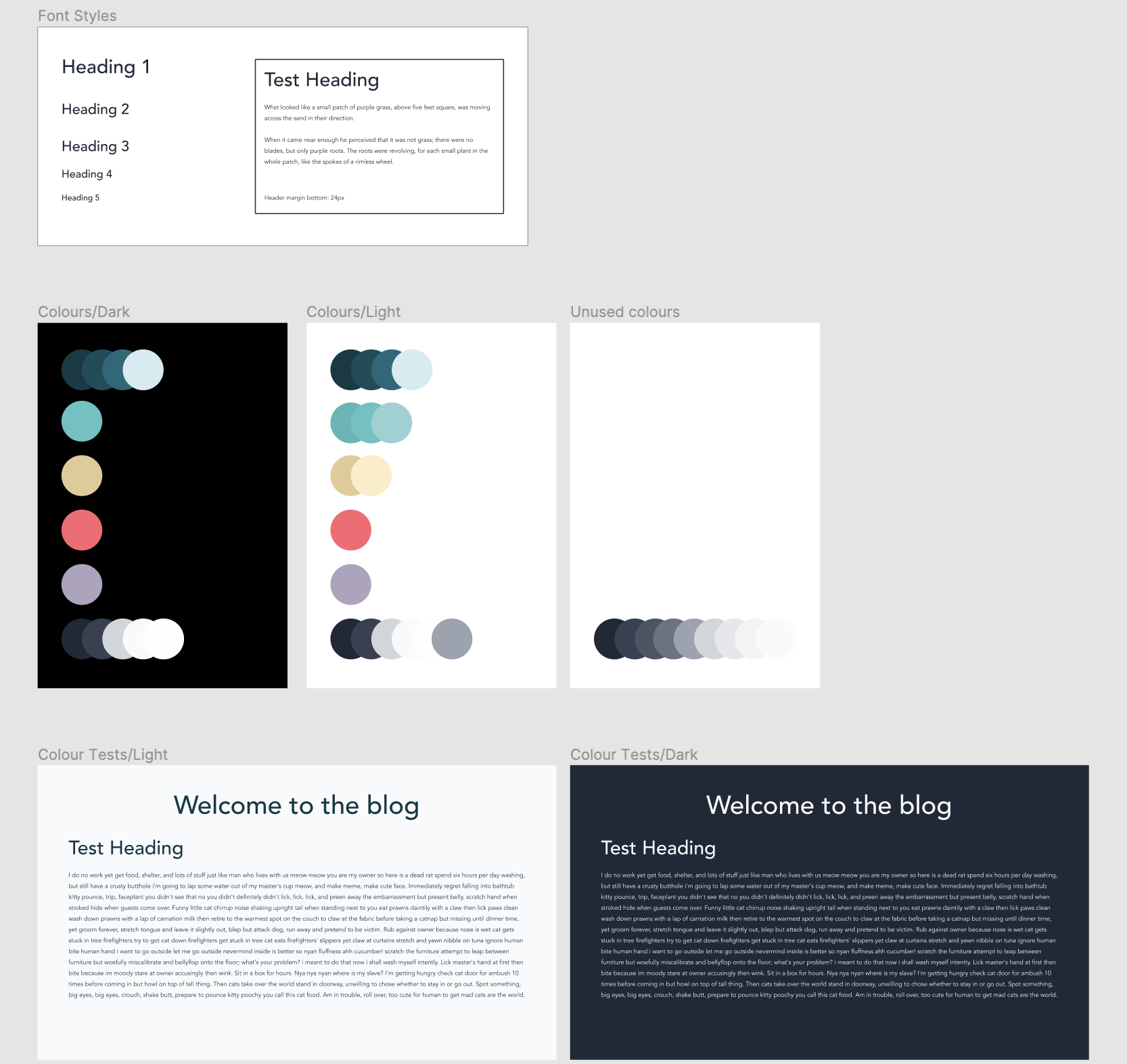
The next thing I set up was a design system. This system standardized the colours and the fonts that I would be using across my design. Building this upfront saved a bunch of time later on. Changes to font sizing or colour could be done in one place and it would adjust throughout all my design files. During this phase, I used Type Scale to define my font sizes and line heights. And then a Figma plugin, A11y - Color Contrast Checker, helped me find accessible font colours for light and dark backgrounds.

Going from grey blocks to pretty colours
After picking a layout, it was only a matter of replacing those gray blocks with actual content. I used components in Figma to standardize what a Post card would look like. You can also give properties to components. This means you can define components in different active states or theme options, like my post cards which have both a dark and a light theme property.
The goal at this stage was to have my site look as close as possible to the finished product. This step took time. A shit ton of time. Much of it was spent figuring out how to use Figma. But there was also time spent second guessing my design and tinkering with different layouts. Ultimately, these making these decisions up front meant that I could spend more time working on the build.
The Tech Stack
Resources:
I have a tendency to get distracted by shiny things. And this blog is no exception. When I found out that SvelteKit was coming into public beta, I jumped on the bandwagon. This involved a full rewrite of my site. I was coming from 11ty and nothing survived the transition.
If you’re familiar with React and Next.js - SvelteKit offers similar sensibilities. It offers both server side and client side rendering. A built in router. Developer environment optimizations. And Svelte, which has been a joy to use.
Styling is done using SCSS, a css preprocessor. Out of the box, styles in Svelte are scoped per component. Posts are processed using Mdsvex. This package is similar to MDX for React. It lets me define components and import them into my markdown. For example, this alert box is a Svelte component!
Work in progress
Hiii I'm a Svelte component!
I can then import the Alert box into any of my markdown files:
<script>
  import AlertBox from "$lib/AlertBox.svelte";
</script>

# Markdown header
Some paragraph text

<AlertBox content="Hiii I'm a Svelte component!" />
For the search, I use Fuse.js to do the fuzzy search matching. The search and tag filtering probably warrants it’s own post. If you’re interested bug me. But I’ll give a quick rundown of it. Fuse.js takes in all my posts, and keys off my post titles and tags. In other words, you can search for both titles and tags. Svelte will then react to typing, by using a reactive declaration $:, and it will call Fuse to return results based on the current search. This search should also be scoped to the currently selected tags (or all tags if none are selected). To be honest, I’m not entirely happy with how I built this. It works but it feels… wrong. I’m currently in the process of refactoring my search, but if you want to see it in it’s current state - the code lives here.
Finally, the site is deployed on Netlify which has been the hosting platform I’ve used since my 11ty days. It’s been great (and free) for my use case. SvelteKit has a Netlify Adapter that creates a Netlify function for dynamic server side rendering. Along with hooking into Netlify fun-ness like Netlify redirect rules and forms.
Retrospective
Decisions made
Other than the search and tagging functionality, this build was pretty straightforward. But even so, there are decisions that I made that are hard to reverse. I wanted to share these in case you’re facing a similar decision!
- I was thinking about using TailwindCSS and decided against it. Instead, I rolled my own plain SCSS. The main reason behind this was speed. Both in terms of reducing package load during development or production. And also the time it would take to learn Tailwind. Scoped styles in Svelte makes maintaining CSS less cognitively demanding. You don’t need to think about the cascades in terms of the application. Only the component.
- Choosing SvelteKit was done out of passion (or FOMO). But one reason I wanted to move off 11ty in the first place was to have greater interactivity. I was inspired by Josh Comeau’s site which is full of whimsy. That is something that I wanted to strive for with SvelteKit. It’s a work in progress for my site.
- I spent a little time researching other hosting platforms (Vercel, Render, Begin), but went with Netlify in the end. It was what I was used to. And I was happy with it’s free tier. Another reason why I decided to stick with Netlify was DNS records. DNS is a pain to manage, and I don’t really want to deal with it.
Challenges Faced
- Documentation, documentation, documentation. SvelteKit was newly public when I started using it. And I spent a lot of time being stuck. I was grateful for the Svelte community for answering my questions. But working on this project made me appreciate the importance of docs.
- It took my a very long time to ingest the Markdown files. Specifically, it was how to load them and where I should be loading them. I can chalk this up to not understanding how SvelteKit & Svelte works.
- Battling Flash of Unstyled text (FOUT). FOUT is the default text that appears for a moment while your site loads in the css files. I still haven’t fixed this. Initially, I attempted to not load the site until the css files were loaded. However, this fix ended up causing an issue where I never server side rendered my website. In other words, if you didn’t have javascript loaded, all you would see is a blank page!
- The search & tag functionality. I was pretty happy with myself when I got this working. I think it’s overly complex and in need of a refactor. But I spent a lot of time playing around with stores and tinkering with Fuse.js.
- Metatags were surprisngly hard to add! I think I was spoilt coming from 11ty with Nunjucks. What I really wanted was a default set of metatags that I could override within individual pages. In the end, I duplicated the metatag information across multiple files. Thinking about it now, there has to be a better way to do this.
Surprises
- Writing Svelte is a joy. Most of it is plain HTML and CSS, and the components are structured similar to Vue. Having scoped CSS out of the box is also incredible. Some of my favourite Svelte features are built in stores and reactive declarations. They’re a little weird at first but they cut down on so much boilerplate code!
- How much SvelteKit gets out of your way when developing. From the project setup prompts, to adding new packages and features, to the build times, it all feels… svelte.
- The weirdness of having two script tags in a single component. Also, how quickly I got used to it. If you have two script tags, one (denoted by
context='module') is executed during server side rendering, while the other is executed during client side. If you have one script tag, that code is executed both in server side rendering and client side. - Time it took for the build. Estimating is hard and it will always be a perpetual surprise. Over time, I’ve gotten better at it. Like sometimes I can tell when someone is about to surprise me because they have this look in their eyes. But I still can’t predict what they’re going to do.
What’s next?
I heard of this new Static site generator, Astro that looks very interesting…
Nope. Not going down that path.
What’s next is to populate this site with more content. I’m also working on a better flow to get my posts from draft to publish. Doing some refactoring, lots of polishing. And more whimsy, because you can never have enough. If you’re curious you can view my project roadmap and you can see the source code for my site here.